top of page
Writer's pictureArthur Bruso

Cover of exhibition catalog Once She Dries showing a banner of blue handmade paper.

An experimental opera and multimedia installation about coral reefs and climate change presented at SMUSH Gallery, Jersey City, NJ, March 3 - April 2, 2023.


The tiny polyps that make up the living structure of a coral reef may only live a few years, but the colony it creates can continue to grow and reproduce for thousands of years. The resultant reefs that are created from the various structures of coral form an ecosystem that support nearly 25% of the world’s ocean animals. The reef colonies are vital communities of biodiversity. The rocky growths surround islands and coastlines to form barriers that calm ocean violence and protect beaches against erosion.


Unfortunately, these coral reefs are also fragile and under threat from pollution, ocean warming, ocean acidification, overfishing, recreational boating, and the very tourists who want to enjoy them. Nearly a billion people worldwide depend on coral reefs for their livelihoods. Yet it is expected that 90% of all existing reefs could die by 205opera1. This worldwide disaster would negatively impact everyone on the planet.


The immensity and urgency of this challenge is the inspiration for Once She Dries. The collective of artists involved in the production are sounding an alarm. To do so, they’ve harnessed the value and function of science — and of myth. They’ve seduced us with song, enveloped us in undulating waves, and affirmed our sense of mystery and awe as we confront and engage with our planet through their multidisciplinary installation. They’ve teased out a tale that recognizes love as its ideal while embracing science as a divine entity. The cosmos swirls in a coral reef and we will be judged on how we proceed.


The gods managed chaos. They might have been as fickle as we mere mortals, but at least we could better understand the vagaries of fate, the cost of vanity, of love, courage, and jealousy through them. The mysteries of the universe were better navigated with the instructive benefit of their mythology. But science decided there was another path to understanding ourselves and the world around us. Science claimed reliability and accuracy. The ways of nature and society could be observed, measured, and understood with systematic study and experimentation. Science was less likely to be corrupted by passion. The gods and goddesses are a passionate lot. Yet, science knows of no absolute truth. Every scientific theory has a provisional dimension. Perhaps that’s the trade off — the passionate vs. the provisional.


The libretto of Once She Dries tells the story of a coral reef in peril, in desperate need of shade and cooling. The reef’s plaintive cry ascends from the ocean floor and releases a cloud-producing vapor. The cloud is charged with finding the nourishment the reef requires. Their bond — the coral, the cloud — and their commitment to each other will bring healing. It is an expression of love. But the way forward isn’t without treachery. All the gods have been eavesdropping. The largest cast concrete dome, home to all the gods — the Pantheon — has become the keeper of the reef. (Coral was once mined for lime to give cement its solidity.) Coral has been trapped under the dome, like Danaë shut up in her bronze chamber, or Eurydice consigned to Hades. What heroic intervention will free Coral?


Once She Dries offers a cautionary flood of hope. Science has rightly put us on high alert. We are stewards of the planet. Charged with its care, we’ve failed time and again. We’re turned a blind eye to poisonous activities. If we implement regulations here, transgressions over there can be ignored, it’s a convenient self-delusion. Our rivers are the birthplaces of civilizations and our oceans and seas feed and regulate every aspect of our wellbeing. Once She Dries is a cris de coeur, a new mythology of science that makes palpable a crisis of global proportion. Data is a cold tool, stark in its utility. The gods of myth with their wayward passions have a keen function too. The artists of Once She Dries suggest the union of the two may prove the way towards our salvation.


Once She Dries catalog shown open to essay page.

© 2023


"Science, Myth, Life and Love," is the catalog essay for the exhibition Once She Dries. It was commissioned from Arthur Bruso and Raymond E. Mingst by the collaborators of the production. The collaborators of Once She Dries are: Megan Woods, story; Nancy Cohen, installation; Xinyue Liu, video; Casper Leerink, piano and sound engineering; Kourosh Ghamsari-Esfahani, violin, sound editing; Amanda Sum, vocals.

3 views0 comments
Writer's pictureArthur Bruso

Updated: Jul 28, 2023


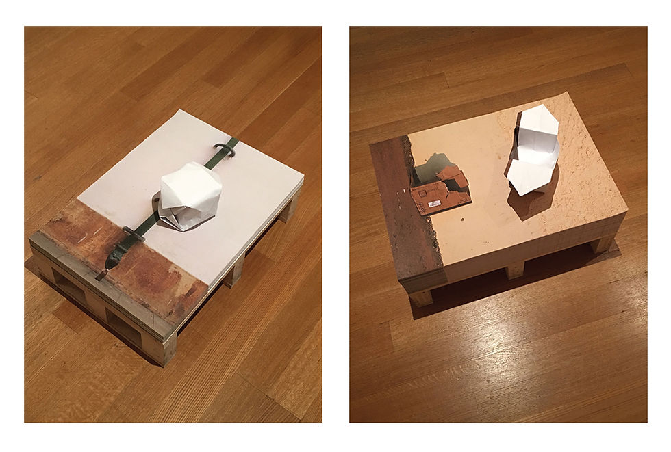
Raymond Mingst and Arthur Bruso, "Volume and Void," an art intervention at the Ocean of Images exhibition at the Museum of Modern Art. Paper origami sculptures fashioned out of Edson Chagas posters. Mingst, Balloon, 6"w x 6"l x 5"h. Bruso, Basket, 8"w x 6"l x 3"h.
Raymond E. Mingst and Arthur Bruso, "Volume and Void," 2015, an art intervention at the Ocean of Images exhibition at the Museum of Modern Art. Paper sculptures fashioned out of Edson Chagas posters. Mingst (left), Balloon, 6"w x 6"l x 5"h. Bruso (right), Basket, 8"w x 6"l x 3"h. Work is lost.


Engaging Museum Audiences and Activating Spaces


Museums have battled to change the perception that they are repositories of obscure artifacts for an educated elite, to a popular destination of interest for a general audience. Increased attendance benefits the bottom line and asserts the relevance of their mission to the public at large while allowing them to keep their doors open. Guided tours remain an easy way to share highlights of an institution’s collection and aid in engaging visitors. The first audio tour was offered by the Stedelijk Museum in Amsterdam in 1952. Headphones were provided that picked up a live shortwave radio signal broadcast by the museum. By 1980, recorded cassette tape tours were introduced which were easier to produce and more adaptable for the museum. These audio guides were among the first steps cultural institutions took toward interactivity between the public and their collections. As technology advanced, so did the devices. Digital recordings, screens, apps, and QR codes are now ubiquitous. These devices activated the exhibition spaces and the items on view, enhancing and providing more information than a static presentation of art or artifacts. Actively engaging with the audience has shown to increase attendance numbers. Attracting a younger audience has been of particular concern to cultural institutions to assure their future health.


Artists have been making works that actively engage viewers in various ways for decades. Some art historians give the Greek painter Zeuxis credit for creating the first interactive work of art in the 5th century B.C. His hyperreal painting of a draped panel encouraged the viewer to vainly try and pull the curtain aside. This work only exists through the record of Pliny, but Duchamp created interactive art in the 1920s which we can still engage with. In the 1960s, Happenings invited group participation. Fluxus created works that had movable pieces which the public was encouraged to handle and manipulate. Artist books, such as Yoko Ono’s Grapefruit offered suggestions to the reader to create their own simple, conceptual and performance art pieces. These were among the ways that mid-20th century artists explored engagement with their audience. The 1960s especially, was a time when artists were trying to break down the barriers of connoisseurship that separated art from the viewer as something aloof and understandable to only a select few.


"Marina Abramović: The Artist Is Present," at the Museum of Modern Art, New York, 2010. Artist performance with public participation. Photo Andrew Russeth, 2010. Seathed woman with black hait wearing a red dress seated across a table from a blond woman in a beige raincoat.
"Marina Abramović: The Artist Is Present," at the Museum of Modern Art, New York, 2010. Artist performance with public participation. Photo Andrew Russeth, 2010

Along with many other institutions, the Museum of Modern Art has embraced audience engagement to enhance and attract a wide, popular audience to its exhibitions. Perhaps their biggest hit in this regard was the 2010 Marina Abramovic retrospective, The Artist is Present. The “interactive” element was the opportunity to sit across from Abramovic in the gallery for as long as one liked. The artist was present, silent, and impassive. In fact, Abramovic was so deadpan and immobile that many attendees who got the opportunity to sit with her tried to break her stoic façade. One brought a huge video camera and filmed her, another wore a wedding dress, another tried to match her stamina by sitting in the chair opposite for hours. The only time Abramovic broke her stony and still performance was when her former collaborator and lover Ulay sat in the chair. She smiled, wept, and held his hands. Otherwise, for nearly 3 months and through 736 hours and 30 minutes, and more than 1,500 individuals, Abramovic sat impassively and only made eye contact with the visitors. Unfortunately, many more never got a chance to sit in the public chair. The show was so popular, the waiting queue often stretched out the museum door and down the street.


Of course, this was not the only work in the Abramovic retrospective. MOMA had restaged five of her past performances and showed many more videos of Abramovic from her archived recordings of past performances, along with photographs and artifacts. The restaged performances, all except one, featured nude performers. One consisted of two nude individuals standing opposite each other in a doorway. The public had to pass between two undraped people in order to enter the main gallery of the exhibition. Here, the breakdown between what was permissible in an interactive work of art and what was not took place. Some of the public could not resist the temptation to touch (some of the performers said groped) the most intimate parts of the performer’s anatomy. There were guards watching for these transgressions, reprimanding the guest after they touched inappropriately. However, this was before #metoo or the redefinition and lower tolerance of what the public considers sexual assault. In 2010, the models who restaged Abramovic’s historic performances accepted the indignities perpetrated upon them as the rigors of their service.


George Brecht, Repository, 1961, Wall cabinet containing pocket watch, thermometer, plastic and rubber balls, baseball, plastic persimmon, "Liberty" statuette, wood puzzle, toothbrushes, bottlecaps, house number, plastic worm, pocket mirror, lightbulbs, keys, hardware, and photographs, 40 3/8 x 10 1/2 x 3 1/8."

The Artist is Present was not the first time that MOMA had experience with interactive art. In its collection is an assemblage sculpture, Repository by Fluxus artist George Brecht created in 1961. The work consists of a cabinet with doors, drawers and cubby holes that have colorful objects placed in them. The concept behind the sculpture is for the viewer to manipulate the doors and drawers and select an object and play with it. The objects can be placed back wherever the viewer wants. With this work, Brecht hoped to blur the boundary between art and life. MOMA does not have this work on display. Manipulation by hundreds of anonymous hands would ultimately destroy the piece. While thoughtful of preservation, it voids the intent of the artist.


Mark DIon, "Memory Box," 2016, wood, roofing paper, steel shelving, and various objects, 114" x 113" x125."

Other artists have worked with concepts that include active public engagement. Mark Dion created an installation in 2016 entitled Memory Box which consists of a construction that looks like a wooden, tarpaper covered, storage shed. Inside, the shed is filled with various, found, small boxes. Inside each box is an object. The contents of the box are not disclosed until the viewer opens it. The element of discovery and surprise as well as the memory that the hidden object may recall are all inherent in experiencing the work. Unfortunately, when this participatory part of the work is allowed, the objects in the boxes often go missing.


Oscar Murillo, 1/2s (Lessons in Aesthetics and Productivity), 2014,  oil on canvas, size variable.
Oscar Murillo, "1/2s (Lessons in Aesthetics and Productivity)," 2014, oil on canvas, size variable. Photo Art Observed.

Attempted thievery happened on greater scale with the Oscar Murillo installation, 1/2s (Lessons in Aesthetics and Productivity), from the 2014 MOMA exhibition, Forever Now: Painting in an Atemporal World. This work consisted of eight unstretched abstract paintings placed on the floor. The artist invited the public in the gallery to move the canvases any way they wanted. At least one visitor to the gallery walked upon the paintings in defiance of their value as cultural objects, another visitor basically tried to steal one of the canvases by stowing it in his backpack and attempted to leave the museum with it. Luckily, this person was caught by the sharp eyes and quick actions of a guard. But this raises many questions, including what are the limits of interaction with interactive art?


How does the institution, eager to engage its audience, manage the public and keep them from overstepping the intended boundaries? How are they educating their visitors, if at all? The five restaged Abramovic performances were supposed to be passively viewed. There was no expectation or requirement for the public to manipulate the performers in any way. The doorway piece was not intended to include fondling. Still, it happened that some of the public took the opportunity to inappropriately take a tactile approach to the work. Many works of art that should not be touched, have something irresistible about them — a texture, form, perhaps a superior realism that nearly commands the public feel it to satisfy what their eyes are seeing. Institutions often put these behind glass or other barriers to preserve them. Unfortunately, denying the public to fully experience the interactive element happens far too often with works of art that are created to be manipulated. The artists seem to underestimate or disregard the wear and tear many hands can impose on a work of art. Oscar Murillo’s floor canvases were supposed to be moved and touched. Was walking on them anticipated? Was it disrespectful? Even the removal could be argued as an extension of the artists intent.


Mechanical devices such as digital screens, buttons, levers can all break down from overuse or abuse. They also can create logistical issues such as impeding traffic flow, which means that their placement must be considered. It is interesting to observe how the public interacts with certain devices or works of art. Why are some so attractive to abuse and theft? Why do crowds form around them at the expense of the passive exhibition elements? Why does the public test the parameters of what is permissible? These are questions that the curators should keep in mind and research when exhibiting work that offers public participation. The takeaway object has become an acceptable way for the audience to participate with an artwork. Takeaway work is part of Felix Gonzales-Torres’ oeuvre, whether it be posters, candy or some other inexpensive and replenishable object. But do the objects that are encouraged to be taken freely need to be quietly removed from the gallery by the public, or can a different interaction be permitted? And what are the guard’s roles in the activated gallery space? How far does their authority go and what preparations do they have when presented with the mounting of an exhibit with an interactive element.


Felix Gonzales-Torres, "Untitled (The End), 1990, print on paper, 28"l x 22"w x 22" h (ideal height).  Posters are white paper with a black border.
Felix Gonzales-Torres, "Untitled (The End)", 1990, print on paper, 28"l x 22"w x 22" h (ideal height). Photo The Felix Gonzales-Torres Foundation.

Deciding what is inappropriate needs to be considered. Touching the nude model without express permission is a definite no. If it happens, there should be real consequences. Unresponsive touch screens should not be the recipient of the user’s anger. No parts of a work, no matter how delightful or small should be stolen. Decorum in the gallery is expected, but are institutions sending mixed signals? Can a casual visitor make the distinction that one gallery invites touching and taking, while another does not? When is a visitor too close to a work of art? When is it OK to engage? What has been put in place by the museum to indicate clearly what behavior is appropriate?


An Ocean of Images: New Photography 2015. Installation shot showing Edson Chagas posters on wooden pallets on a wooden gallery floor. Various artworks on on the walls.
An Ocean of Images: New Photography 2015. Installation shot showing Edson Chagas posters. Photo Museum of Modern Art.

While viewing the Museum of Modern Art’s photography exhibition, An Ocean of Images: New Photography 2015, fellow artist Raymond E. Mingst and I came across the Edson Chagas’ installation. In this group exhibition, Chagas, an Angolan photographer, had five pallets of posters sitting on the gallery floor. The images on the posters were from Chagas’ series Found Not Taken. With this series, he photographed discarded objects in his hometown of Luanda, Angola, repositioning some to achieve a more artistic interaction with their environment, while leaving others in situ. Superficially, the stacks of posters were reminiscent of Felix Gonzalez-Torres’ installation of printed takeaways. Gonzales-Torres’ stacks of free posters had implications of the lives that were taken by AIDS. Chagas’ poster takeaways did not share such poignant humanist symbolism. Instead, his images refer to the way humans use, reuse, then discard objects, giving Found Not Taken an element of the human impact on the environment. The presentation to a degree defeats observing the images. They are obscured until one is directly over the top of a stack. What gives the most visual impact in the gallery are the blocks of stacked paper on the wooden pallet supports.


When Raymond and I saw these pallets of posters, we were curious about their intention. Were they simply souvenirs, or like Gonzales-Torres, was there an intention behind the presentation itself? We were told by the security guard that the posters were free to be taken. The stacks on the pallets were somewhat diminished but still plentiful when we were there. Although well composed, I was not taken by the images.


The notion of interacting with the installation intrigued Raymond. He took a poster and promptly folded it into an origami balloon with the image facing inside, effectively merging his idea with Chagas’, while upcycling the paper. He chose an image of a plastic bottle that had been placed at the bottom of a downspout to coincide with the concept of the balloon as a volumetric container. He returned his paper sculpture back onto the top of the poster stack he had taken it from. Mingst explains his reaction to the installation, “My action was a small gesture that paralleled in some way what Edson was doing on the streets with found objects -- reconsidering them and creating icons. In the moment, it felt like an offering. It seemed right in the context of the exhibition as well, the exhibition itself was exploring themes of authorship, the fate of imagery, control, value, context, and participation.”


Following Raymond’s lead I chose a poster from a nearby stack, folding mine into an origami basket. The poster I chose had the image of a cardboard box, which paralleled my square basket, both being voids for filling. I also chose to devise my object in response to Chagas’ image and placed my completed sculpture on top of its home stack as well.


The other people viewing our interventions on Chagas’ work, were at first curious. No one in the gallery at this time had yet taken posters, they were “respecting” the work as good museum goers should. When Raymond noticed the curious glances, he began encouraging others to create their own pieces. When asked, he said that the posters were there for the taking and to use as they wished. Soon the gallery was filled with people freely taking the posters and folding them into, hats, boats, airplanes, anything that came to their minds. Most placed their creations back on or against the stacks of posters. Somehow, the public began responding to Raymond as if he were leading a workshop, asking him questions, and showing him what they had made. The event soon grew into a crowd that filled the gallery, everyone sitting on the floor or leaning against the walls manipulating the paper. At first, I was amazed at the public response, then as the maker's Happening grew more chaotic, I began to get alarmed that we would get in trouble for inciting a mob scene in the galleries.


Three photographs of people at the Oceans of Images at the Museum of Modern Art interacting with the Chagas posters.
Attendees at the Oceans of Images at the Museum of Modern Art interacting with the Chagas posters, 2015.

The public folding the posters and placing them for display in the gallery at the Oceans of images exhibitions at the Museum of Modern Art, 2015.

It all ended when another guard walked into the room and asked the guard on duty what was going on. The guard on duty said, “I don’t know. I went to lunch and when I came back this was happening.” The two guards then quickly put an end to the crafting festivities, but I had never seen the public more happily engaged with the art in a museum then I had under Raymond’s guidance.


Museums have their own agendas when it comes to exhibiting and interpreting an artist’s work. The Museum of Modern Art has long been known and criticized for its personal interpretation of the history and evolution of Modern Art, (e.g., the revisionist theory that Modern Art follows a logical, evolutionary course; or the reductive stance that Modern Art tends to get visually simpler but conceptually more complex as time goes on). From MOMA’s response to the joyful atmosphere of play in the gallery where the Chagas’ poster stacks were on display, it expected and ultimately enforced that the “interaction” that was to take place with Chagas work was for the public to take the available posters and leave with them. They did not expect nor was the institution interested in any variation of that narrow interpretation of “interaction.” Having the public use the free art as anything other than a souvenir of their visit was not encouraged. When the public did in fact find an alternative use for the posters, their display of personal creativity was curtailed – even though no other works of art in the gallery were endangered. I cannot fault the museum for wishing to maintain order in its galleries. I do not advocate damaging or destroying works of art for any reason. The works of art are important examples of our collective cultural and visual history and should be preserved for future generations. Still, something extraordinary happened in the Oceans of Images gallery that afternoon. The viewing public took the opportunity of using a free takeaway and repurposing it for their own creative vision. Instead of being even curious about this reaction to Chagas work, MOMA’s curators dismissed it as chicanery and an imposition not in accordance with their policies. The resultant work of those who refashioned the Chagas posters into other paper sculptures was collected by the guards. Its ultimate fate I assume was the trash bin. I make this assumption since the curators did not know the intervention event even happened until Raymond wrote a letter to the curators describing the event. The assistant curator who answered Raymond’s letter, restated the official policy of keeping decorum in the galleries and offering him the opportunity to purchase an artist membership. The guards had a different take on keeping order in the galleries, as the Director of Facilities and Safety of MOMA explained to Raymond via e-mail: “Overall, interactive works can be challenging for our security officers because visitors, at times, take the touching notion to other exhibits in the building that are not interactive. Visitors sometimes think they could walk away with those interactive artworks. The key point is understanding the challenges from the eyes and voices of our security officers and taking measures to minimize those challenges prior to the opening of the exhibition.” It would be of tremendous value if the frontline insights of the guards were more thoughtfully considered by the curators.


Paper objects folded out of the Chagas posters made by the public in the Ocean of Images Gallery at the Museum of Modern Art.
Some of the creative paper objects that the public crafted from the Chagas posters at the Oceans of Images exhibition, Museum of Modern Art, 2015.

Many artists have tried to chip through the impassive monolithic façade of the Museum. Dada in the early 1900s tried to wrest the definition of art from the galleries and museums by reiterating that it was the artist who determined what art was. Fluxus in the 1960s and 70s tried to circumvent the idea that art has enormous value by creating art that was intended to be uncollectible. Neither movement was successful in their endeavors. The museums found a way to commodify the work and give it value. If a work was truly temporal, the museum prevailed by preserving the artifacts of the artist’s endeavors or photographs of the work in lieu of the actual work of art. We need institutions with the knowledge and ability to preserve culture. These institutions also need to be able to sift through the vast quantities of human expression and make decisions as to what needs to be preserved. But it is a curator’s job to be present and be aware when something they have chosen has not had the reception that was anticipated, especially when the exhibited work incites a new creative direction. The alternative interpretation needs to be acknowledged, studied, and understood instead of being dismissed as a tiresome inconvenience.


Recently, an informed public has been making its disapprovals with the status quo of museum programming and funding. The overlooking of women artists and artists of color has been put to task and a new inclusiveness in curatorial practice has started. Where an institution’s funding is coming from has been given new scrutiny by the public, and socially dubious or climate threatening financial sources are questioned. Institutions must answer the questions posed by an informed and concerned public about their inclusiveness, socially acceptable practices, and efforts to combat climate change if they are to continue with the business of art. The museum as impervious and imperious taste maker is waning. These are not actions that are going down without resistance, but as happened with the traditional European academies the new ideologies must be recognized and validated or expect the institutions to fall.


Arthur Bruso © 2023


101 views0 comments
Writer's pictureArthur Bruso

Tim Hawkinson – "Penitent," 1994. Rawhide dog chews and slide whistle; motorized, with sound, 48-3/4″ x 18″ x 19-1/2″ skeleton with a light shining on it against a dark blue drape.
Tim Hawkinson – "Penitent," 1994. Rawhide dog chews and slide whistle; motorized, with sound, 48-3/4″ x 18″ x 19-1/2″

I had a professor in art school who believed that humor in visual art was very difficult to pull off. He maintained that only a few had succeeded without falling into cartoons. Tim Hawkinson generally succeeds with his work. “Penitent,” is one such work that uses tongue-in-cheek humor while also giving the viewer something to ponder. The work is constructed out of rawhide dog chews in the shape of bones. It also incorporates a mechanized dog whistle nestled inside of the rib cage. This creates not only the idea of attracting dogs to gnaw on the piece, but takes on the additional task of attracting the dogs with the whistle. So what Hawinson has devised is a work of art that through its form could attract its own demise, it nearly assures it with the attention getting whistle.


When I saw the piece it was displayed inside of narrow space that resembled a confessional box from a Catholic Church. Add the title is “Penitent,” and additional layers of atonement and punishment become recognized. This changes the humor of a skeleton made of dog chews, into a work of pathos and sympathy.


Hawkinson treads that line between humor and seriousness with aplomb, where the viewer at first glance chuckles at the obvious joke only to check themselves when the deeper meaning becomes apparent. Some art is deserving of a second glance and a longer ponder.


Arthur Bruso © 2017


5 views0 comments
bottom of page